VocabularBee

A colorful, gamified vocabulary application for language learners on-the-go!


The Challenge:
Create a vocabulary learning application, where users can study new words on the "fly"!
My Role: Lead UX Designer & Researcher
Project Duration: 1.5 months
Project Brief:
Who? Students and professionals studying new vocabulary
What? A mobile application focused on learning new vocabulary
When & Where? Anywhere, anytime and especially when the user has limited study time
Why? To empower people as they learn new words & definitions
The Fine Print:
The app must contain:
-
An onboarding page
-
Sign up & Log in
-
A method for adding new words/definitions
-
A means of reviewing vocabulary
The Process:

Understand
-
Competitor Analysis
-
User Research
-
User Needs & Personas
Competitor Analysis:
I analyzed four vocabulary learning/flashcard applications, focusing on their strengths and weaknesses in usability & interface design.

I used the framework of my project's scope as a guide to my analysis, doing side-by-side comparisons of each app's onboarding, sign up/log in, admin, and menu screens, as well as their add and review vocabulary flows.
.png)
I compiled my results into a chart, and ranked each app on a scale of 1-4 where 1=least likely to use and 4="Sign me up!"

Seeing what worked well vs where the competition left opportunities for improved user experience led to an initial brainstorm of my app's "must have" features.
.png)
User Research
Next, I created a user interview script and recruited 7 participants to tell me about their experiences using flashcard/vocabulary learning apps. My participants ranged in age from 12 to 64 and represented students, educators, and working professionals.
Interviews were conducted over the telephone allowing me to gather data from users across the US!
(California, Oregon, Kentucky, Texas, and Arizona!)
The information gathered through these user interviews was incredibly helpful to deciding which features absolutely must be included in my designs. Hearing from each participant about their frustrations (pain points) and favorite functions (wish lists!) further refined my vision for exactly how to create an effective and delightful experience for users.
User Needs & Persona
Now that I'd heard from a wide range of users, it was time to hone in on the target audience for my app. In an effort to represent all the perspectives from my interviews, I created a "proto persona" that encapsulated the needs and challenges of both a working professional and a full-time student.

I identified my persona, Sunny's, needs and wrote several user stories summing up exactly what she needs from a vocabulary learning app. This led to creation of a working hypothesis for the project.

Using her *voice* through quotes, I pinpointed where the app must provide specific functionality. Beyond the flashcard capability and ability for students to study anywhere, anytime (maximizing learning when there may only be a few minutes to spare for study at a time), I had also identified that a feature allowing for spelling practice would offer something different than the current market competitors.

Ideate
-
User Flows & Task Analyses
-
Paper Wireframes
User Flows & Task Analyses
With my persona and her specific needs in mind, it was time to start mapping out the architecture of my application. How would a user complete the desired tasks? For each feature, what would the smoothest, simplest progression look like from start/"entry point" to finish/"success criteria"? I then itemized the process further as task analyses to break down user actions to plan for necessary frameworks within the application on an even more detailed level.

Paper Wireframes
I now had a solid foundation and it was time to sketch out paper wireframes of all the designs I'd been brainstorming. With a background in Fine Arts, this is one of my favorite steps in the design process. There is something so magical about using a pencil and paper and seeing your ideas come to life in moments!

I drew over 75 separate paper wireframes, fleshing out my entire processes for onboarding, admin/setting screens, menu/home page, and four separate study features in one day! When you enjoy the task, time flies.

Prototype
-
Paper Prototyping
Paper Prototype
There are multiple methods for creating a prototype from paper wireframes. In this case, I chose to use Marvel. This required photographing each of my wireframes, uploading to Marvel, and then linking interactive "hot spots" on each wireframe to where a *tap* would navigate. It was a labor-intensive process, but ensured as realistic an experience of the app's capabilities as possible for our next step - user testing!

Test
-
Usability Testing
-
Data Analysis & Reporting
Usability Testing
To accurately test usability, I created a script and conducted six moderated test sessions - one in-person and the rest remotely via Google Meets.
I measured success vs errors with specific tasks such as:
-
How would you navigate to create a new set of flashcards?
-
How would you locate a set of flashcards you've previously made once you're ready to study?
And I collected feedback to gauge overall user experience and satisfaction/engagement:
-
Flip through a few flashcards - is it intuitive?
-
Which of the other study features are you most interested to try? Why?
-
Did you find the tutorials effective?
Data Analysis & Reporting
The usability tests identified a handful of instances where user errors were occurring. I used Neilsen's rating scale to rank the errors in terms of severity (1-4) and I synthesized the data into a report of my findings with itemized plans for revisions.
User Feedback identified the following opportunities to improve my designs:
-
Simplify! Simplify! Simplify!
-
Rename "Search" to "Sets" on home page
-
Skip option for tutorials
-
Create set name prior to flashcard creation
-
Customization of card design?!
Iterate
-
Refine Designs
-
Mid-fidelity Wireframes
-
Apply UI Design Principles
-
High-fidelity Mockups & Prototype
Refining the Design
Since I'd been working with paper wireframes, new iterations meant creating all new sketches for any revised screens. I changed the menu options slightly for clarity, and simplified wherever possible.

I also added completely new screens such as the settings menu pages enabling users to customize their flashcards color and font. One participant mentioned that would be a fun feature, and I agreed!

Mid-Fidelity Wireframes
Now that user-generated edits had been made to my paper wireframes, and I was confident in the usability of the app, it was time to create mid-fidelity wireframes in Figma. Using a 4 column grid to ensure consistent spacing, I defined breakpoints for mobile to ensure that each wireframe would allow enough space for all screen elements at the smallest size (mobile-first design).

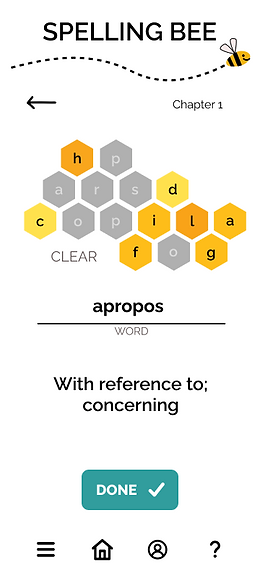
From here, I began to fill in copy content from my paper wireframe, selecting typography and iconography that began to bring the app to life. Mid-fidelity is traditionally shown in greyscale, but I did create a full-color vector for the "honeyhive" for the Spelling Bee feature, as well as a vector of my logo/mascot, the Bee, and his flight trail which would act as a header on each wireframe. I included these finalized elements on the mid-fidelity wireframes despite their color.


Tap image to zoom in.
Applying UI Principles
It was time to apply visual design principles and make the final decisions that would be reflected in high-fidelity iterations of my wireframes. I reviewed each wireframe specifically for adherence to best practices for accessibility and usability using principles of hierarchy and spacing (including grouping/proximity, balance, and contrast/emphasis).
Color
Next up was application of color, and for me this part is always the hardest. The stakes feel so high! Color plays such a critical role not only in clear communication of the how-to's of app features and flows, but also in terms of overall tone and feel. With so many colors to choose from, selecting just the right color palette can be tricky. To assist in color palette creation, I began by putting together a mood board.
Mood Board

The mood board revolved around three ideas (drawn from the project brief) that encapsulate the essence of the VocabularBee app: colorful, playful, and "on-the-fly". I knew I wanted to play with warm yellow tones to continue the bee theme, but keeping the vocabulary-learning focus clear and effective with high contrast text of black on white. I also was interested in using a typeface that was reminiscent of old-school dictionary definitions, creating another visual cue for memory coding. I collected representative images, fonts, and examples of successful usage of yellows and oranges with text in black and/or white, paired with an accent shade of teal.
Color Guide
This led to the creation of a color guide, which I was then able to use as I incorporated color and final imagery into my wireframes.

The Result:
A colorful, playful vocabulary learning application, where users can study new words "on-the-fly"!
High-Fidelity Mockups and Prototype
With the addition of color and imagery, the first iteration of my high-fidelity mockups was complete. The project is currently in progress, as I complete further usability and preference testing, which will inform further adjustments and iterations.

Watch my video walk-through of the
VocabularBee application or tap the button below to explore my prototype yourself!
Introduction & Onboarding Screen Examples


Feature Example Screens